My website address is: https://coulsonlucy25.wixsite.com/valeo
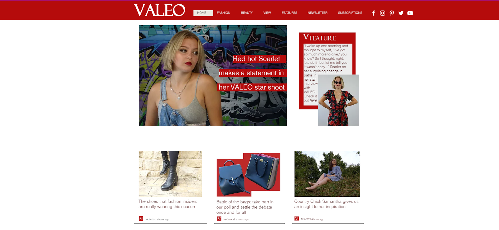
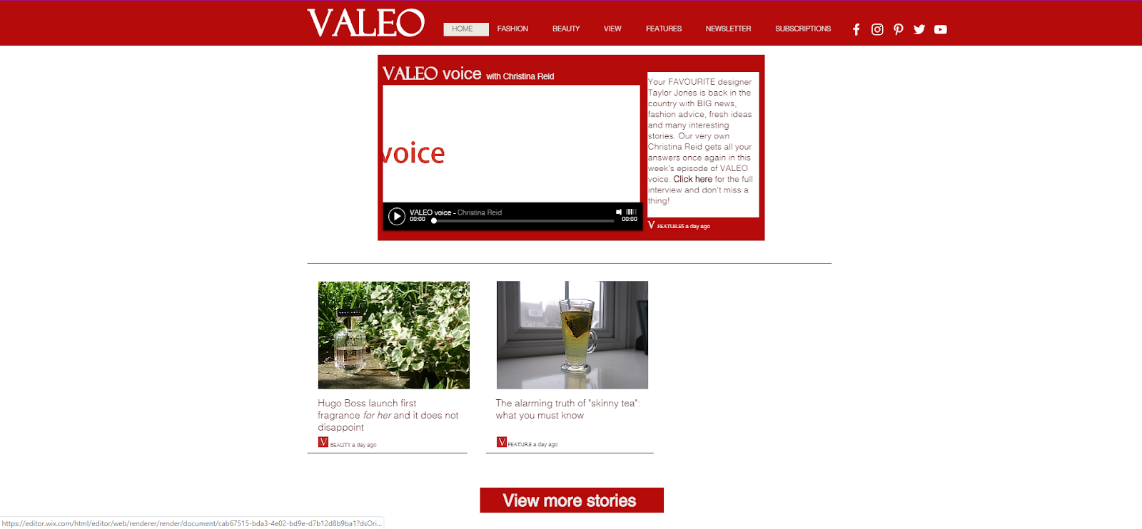
Home Page:

fashion page:


 I find this picture and link interesting as it is second person, targeting the audience directly. The picture links to the article as many browns and dark greens have been captured, which are autumnal colours.
  Further down, past the fashion story are more links to articles on celebrities and gossip. This implies that readers are not only interested in fashion. Also, it is clear that Grazia is aimed at an older generation as the focus of the stories are about older celebrities.
 The first main articles you see on the Teen Vogue website are not fashion related, however are focused more on gossip. Each heading is categorised under a news type, for example "entertainment" or "TV." The fonts and colours used match the masthead to create synergy throughout the page. Target age group has clearly been taken into consideration as the articles are aimed at the younger generation, as there are articles about celebrities popular with teenagers and TV shows aimed at teens.
 The first actual fashion heading on the website is a few articles down and again focuses on a popular celebrity. Also, the "yellow thigh high boots" the article is about are not shown in the picture, leading the audience to click on the link them and find about more.


 It is important that magazine front covers have synergy and a brand identity. This front cover in particular has created synergy from the colour of the models clothing. For example, a lot of shades of pink and white have been used for the fonts and puffs in order to link to the picture. The masthead has been created the exact same through all magazines, however the colour of the masthead changes accordingly to how the model is dressed. This is something I would like to take into consideration when creating my front cover, as I like how the fonts and colours have been decided after the picture was taken.
  Brand identity is created here as this implies that Teen Vogue magazine is the "best." Having an off lead entitled "best of beauty" suggests that Teen Vogue articles only discuss the very best of fashion and styles, encouraging people to buy the magazine. This helps to create brand identity as this is now what readers of the magazine expect, to be updated on the latest and greatest fashion trends.


 The off leads are interesting because they specifically link to men, for example "the cheap man's guide to looking expensive." This makes the magazine exclusive to males, which is something I do not want in my magazine. This has made me realise I would like to advertise my magazine for both genders, and make it as clear as possible on the front page.


 This would be a suitable background for my advert because it is similar to the background on the original advert as the sun is in the same place and there are a lot of the same colours. It links to the fragrance as its floral and represents spring as the sun is coming though at the top of the image.
  I like this background because there are actual daisies which obviously represent the fragrance as it is called Daisy. I think that this would help the audience make the connection of the two, therefore they would want to buy the product as daisy's represent flowers which are stereotypically beautiful.


